Thumpers: A Sporty Display Font That Lifts Your Digital Brand
It started with a hero section that felt flat. I was redesigning a landing page for a small fitness coaching business — clean layout, strong imagery, clear value prop — but the headline just didn’t land. The current sans serif felt safe, but not *energetic*. Not *confident*. Not quite *them*. So I pulled up my font library and typed “Thumpers” into the search bar.
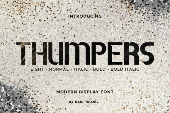
Right away, Thumpers stood out: bold terminals, tight spacing, subtly rounded yet assertive letterforms. It’s a modern display font with sporty DNA — think athletic apparel branding meets editorial punch. Not aggressive like a stencil or chaotic like a script, but grounded, rhythmic, and unmistakably human in motion. The characters feel like they’ve got momentum — especially the uppercase “T”, “H”, and “R”, which anchor headlines with visual weight and subtle bounce.
I dropped Thumpers Regular into the H1. Then tried Bold. Then Bold-Italic over a muted gradient background. Each time, the hierarchy tightened. Users weren’t just reading the headline — they were *feeling* its intent before scanning the subhead. That’s the quiet power of a well-chosen display font: it sets tone faster than any color palette or icon.
Thumpers ships with five styles — Regular, Bold, Light, Italic, and Bold-Italic — giving real flexibility across digital contexts. In practice, I used Bold for primary headlines (hero, section openers), Regular for secondary headings (feature cards, testimonial quotes), and Light for subtle accents (taglines, bylines). Italic added warmth to short pull quotes; Bold-Italic worked surprisingly well on CTA buttons where contrast and clarity mattered most — especially against dark mode backgrounds.
But here’s what surprised me: readability held up better than expected on mobile. At 28px on a 375px viewport, Thumpers remained legible without sacrificing personality. Its generous x-height and open counters helped — no squinting, no misreading “a” as “o”. Still, I kept it strictly for short-form use: headlines, banners, button labels, social media graphics, course title cards. Never body copy. Never paragraph text. That’s not a limitation — it’s intentional design discipline. Thumpers is built to command attention, not sustain it.
I paired it with Inter — a neutral, highly legible sans serif — for all body text, form fields, and navigation. The contrast worked beautifully: Thumpers brought energy and brand voice; Inter delivered calm, clarity, and accessibility. For a more editorial feel — say, on a wellness blog redesign — I’d consider pairing Thumpers Bold with a warm serif like Cormorant Garamond for article titles, letting the display font spark interest while the serif deepens trust and authority.
In real layouts, Thumpers shined in specific spots: the “Join the Challenge” banner on a coaching site, the “New Collection” badge on a boutique online store’s homepage, the “Enroll Now” button on a course sales page, and even the logo lockup for a creative portfolio site (used at 48px, centered, with ample whitespace). It never overwhelmed — because I respected its role. It’s not a workhorse font. It’s a spotlight font.
One practical note: before dropping Thumpers into production, I checked the webfont files. It supports WOFF2 (ideal for fast loading), includes Latin-1 and basic Latin Extended characters, and handles common diacritics cleanly — enough for English, Spanish, French, and German content. No multilingual surprises. Licensing is straightforward: one-time commercial license covers websites, client projects, SaaS dashboards, digital templates, and branded assets. No monthly subscriptions, no usage caps — just clean, ethical access to a premium font.
Where Thumpers truly elevates UX isn’t just in aesthetics — it’s in perceived professionalism. On a product landing page, seeing a considered, confident typeface like Thumpers tells users you’ve invested in craft. It signals intentionality. That matters when someone’s deciding whether to sign up, buy, or click through. It’s not about being flashy — it’s about removing friction between your message and their understanding.
I also tested it over image overlays — specifically a high-contrast hero photo with a semi-transparent dark scrim. Thumpers Bold at 42px popped instantly. No need for heavy text shadows or outline effects. Its stroke contrast and letter spacing naturally separated from busy backgrounds. Same went for light-on-dark UI patterns: on a dark-themed dashboard header, Thumpers Light provided just enough presence without glare.
That said, avoid cramming it into tight spaces. Small buttons (under 140px wide) or narrow navigation items? Skip it. Thumpers needs room to breathe. Its strength lies in scale and simplicity — not density. And while the Light weight is elegant, don’t push it too small or too light on low-DPI screens. Stick to 20px minimum for Light, 18px minimum for Bold on desktop — and always test on actual devices.
For digital product creators building brand kits, Thumpers fits neatly into tiered typography systems: Level 1 = Thumpers Bold (hero, logos), Level 2 = Thumpers Regular (section headers), Level 3 = your neutral sans or serif (everything else). It gives clients immediate visual distinction — no vague “modern vibe” briefs needed. Just show them Thumpers in context, and the brand direction clicks.
Ultimately, Thumpers isn’t about trendiness — it’s about resonance. It’s the kind of display font that feels native to digital interfaces because it balances personality with performance. It doesn’t fight the screen; it works with it. Whether you’re launching a new course, refreshing a portfolio, or building a campaign landing page, Thumpers offers a rare blend: strong character, smart structure, and genuine usability.
If your current headlines whisper when they should thump — this one’s worth trying.